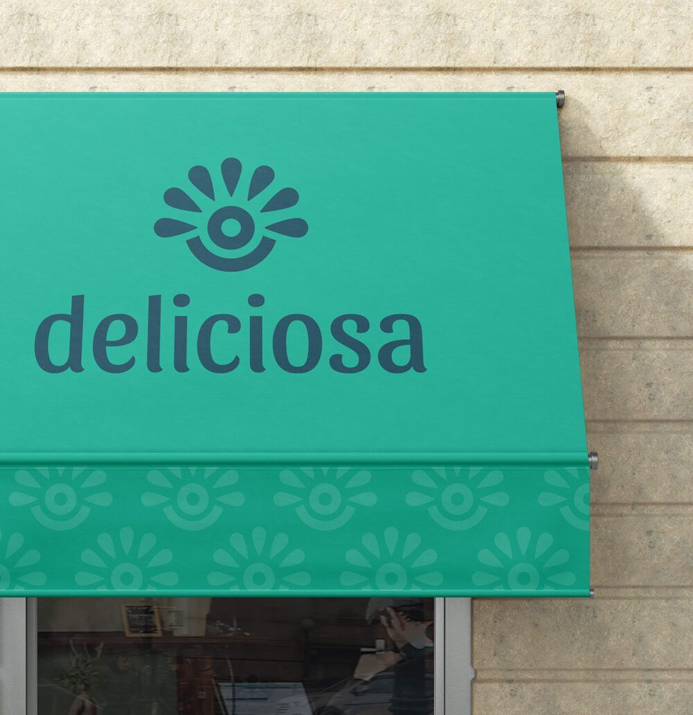
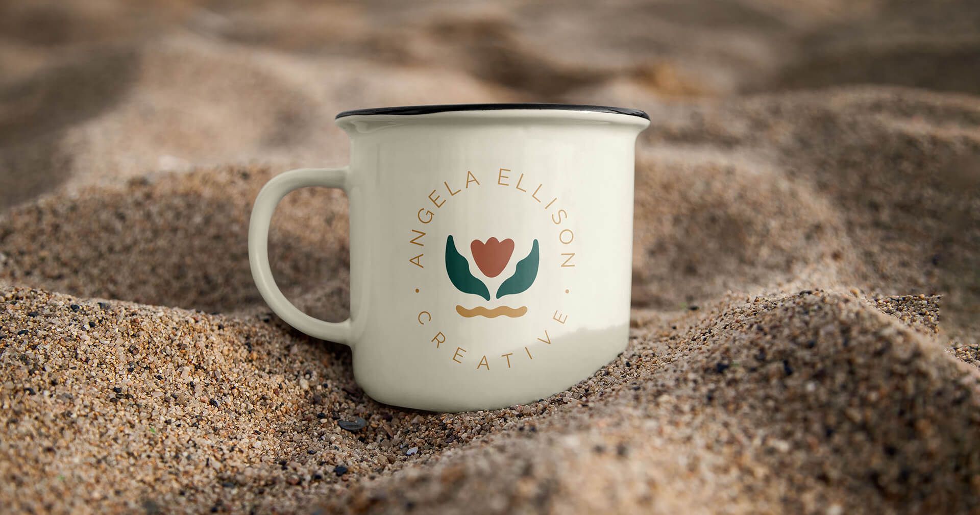
Branding and logos for food-based businesses
Brand Strategy
Visual Identity
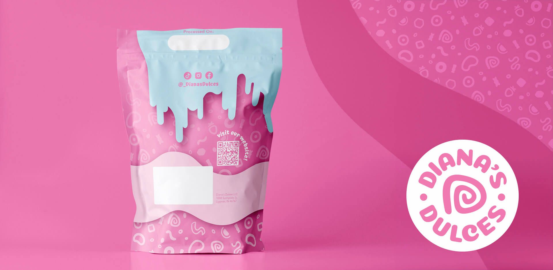
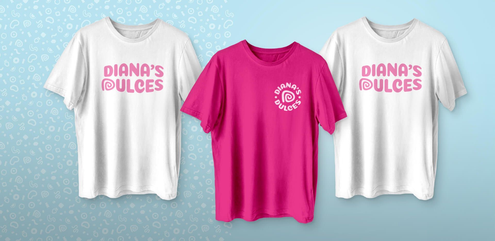
Package and Print Design
Extra Brand Assets
Rebrand overview
Enticing rebrand for a candy brand led by a determined founder with BIG dreams.
Diana's Dulces was started in 2021 by Diana and has grown into a family run business. Growing up, her goal was to become an entrepreneur and she found the inspiration for Diana's Dulces in her love for spicy candy.
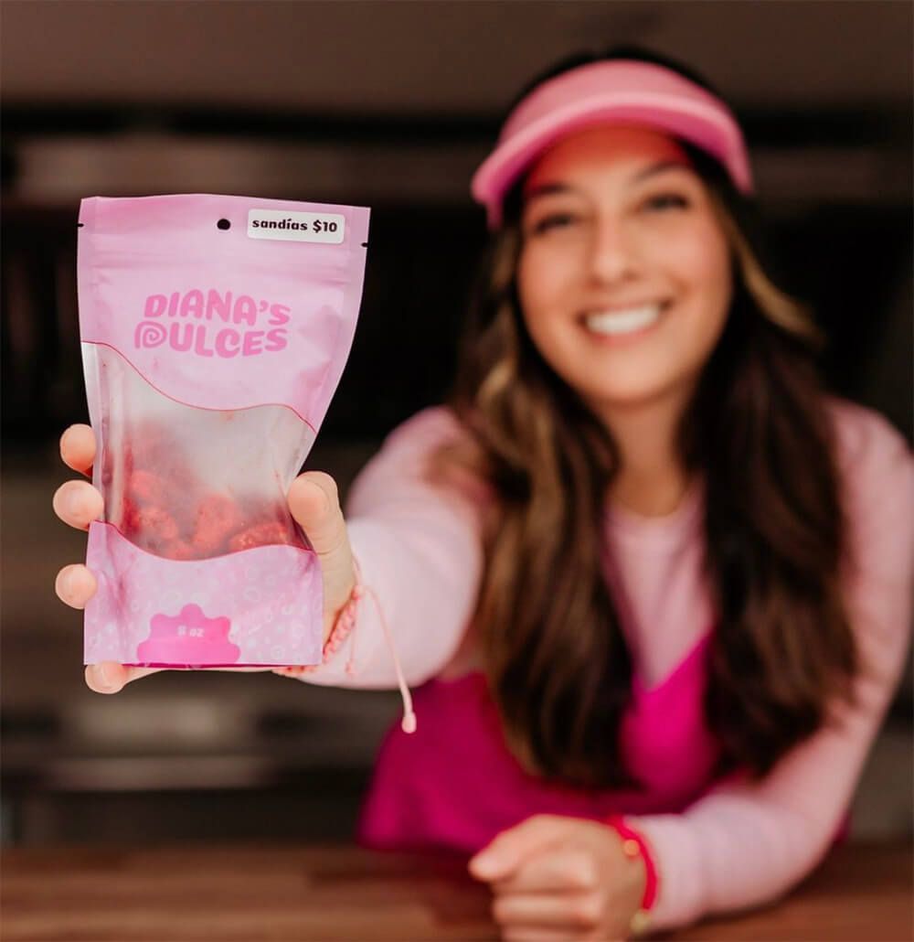
Diana's Dulces needed to update their logo and expand their visual identity to keep up with their growing brand. They wanted something to replace their DIY'd logo and packaging. Something unique to them that reflects the quality of their product and the personality of their brand to draw in new customers at markets.
Have you been considering a rebrand? You can read more about “10 signs you need to rebrand”on RLC Roots (Substack).
Objectives
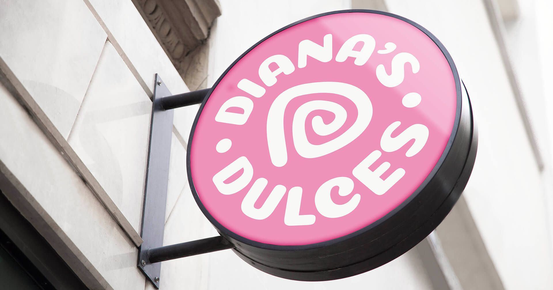
- Build a logo and logo family that represents the core essence of the candy brand.
- Develop the primary logo into a logo family that can be effectively used across a variety of marketing content.
- Create a condensed brand guidelines document to help create a consistent brand experience for customers, new and old.
- Design packaging that invite new customers to give the candy a try.
- Create on-brand, custom packaging that is unique to your brand and connects with your customers.

strategy & design
We illuminated a brand inspired by the bold use of colors in Mexico. Candy with this much flavor needed design to match.
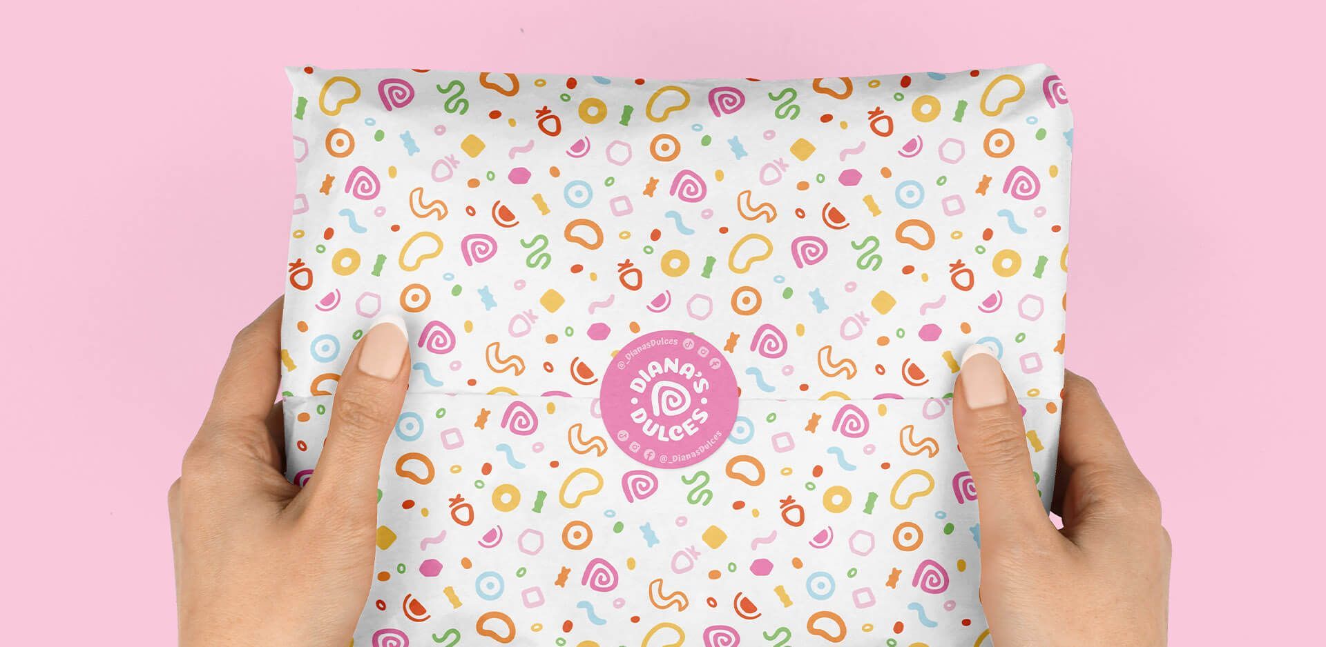
Bold flavors and bold branding go hand in hand. If you've ever felt a disconnect between your designs and your product, you're in the right place. We created a fun, engaging brand identity for Diana's Dulces to match the energy they put into their business and products. Also designing extra brand assets for use on their packaging and stickers.
Custom illustrations for identifying flavor stickers and a brand pattern round out this project to create something truly captivating. You can see all the stickers on our
Pinterest, give us a follow to see what we create next.
Clearly defined color scheme allows them to stand out from local competitors offering a similar product. Now they've doubled down on the use of their pink tones throughout their displays, but they've got room to change things up as they continue to expand.

the impact
“I LOVE it all! So excited! Obsessed with our new custom packaging! ”
Diana Ramirez
Founder at Diana's Dulces
The bold ambitions of their founder are now captured in Diana's Dulces professional brand identity. Now they stand out at every event, drawing in new customers and making it easy for return customers to find them. Their market display has transformed into a sea of pink and other vendors are following their lead—talk about trendsetter.
Since working together Diana was able to create the mobile candy vehicle she'd talked about on our first call together. Did I mention that it is bright pink? If you are ever in or near Goshen, IN I highly recommend seeking it out. I love Diana's energy and how she continues to prove that a small, family-owned business can dream BIG too!
To explore Diana’s shop and order some of the best enchilados I've ever had
(my favorites were gushers and skittles), visit her website.
Discover More