Creative branding for food brands
Brand Design
Visual Identity
Print Design
Illustrations & Pattern Design
overview
Vibrant, engaging visual identity for a fun, passionate food vendor.
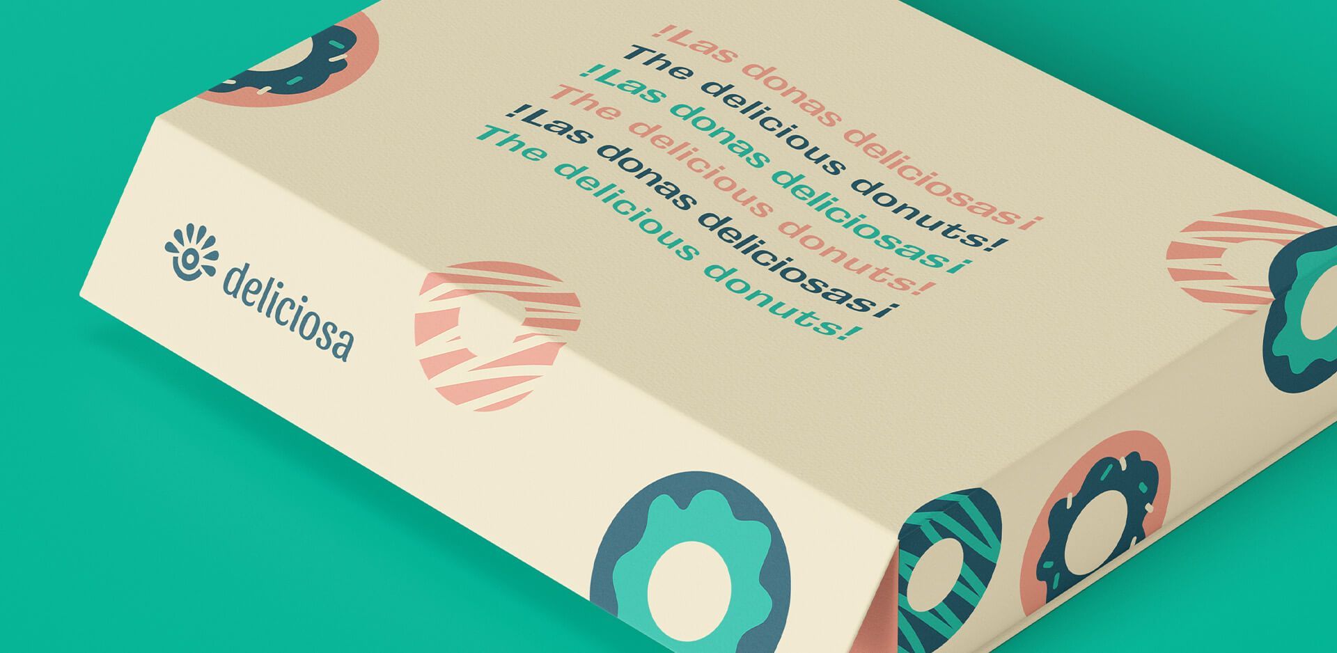
Deliciosa is a food vendor who serves fresh apple cider donuts at various events. They even started serving donuts with ice cream last year, YUM! Being warm and inviting for anyone walking past is an important part of their business mission.
Ali took over her father’s food vendor business and knew that she wanted to make their branding more of a priority. She wanted a beautiful brand identity that represented the core of their business roots.
Objectives
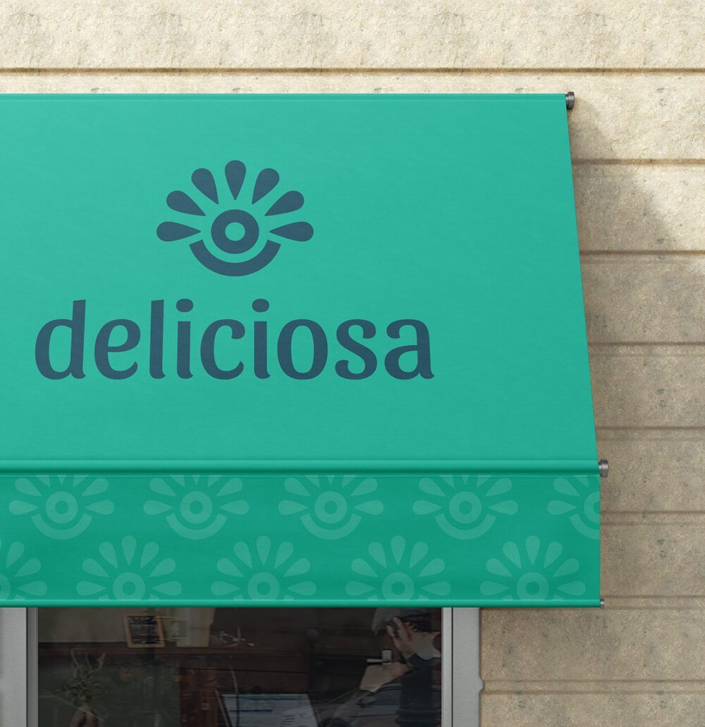
- Create a new logo family that is versatile for print and digital use.
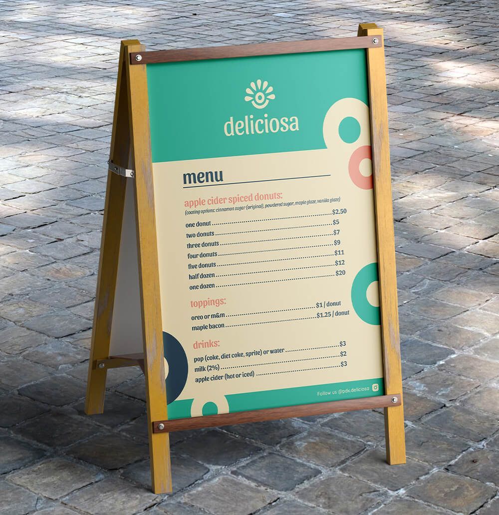
Logo and extra print materials need to be legible, even from a distance.
- Ali wanted a minimal, versatile logo that would not tie their stand to any one type of food.
- Bright and bold since they will be competing directly beside other food vendors at events.
- Create a logo that captures the story of their business.
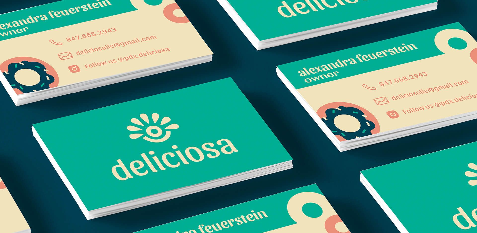
- Design printed materials (banners, menu, stickers, and business cards) that follow the new brand guidelines.
strategy & design
A creative logo that tells the story of their business journey. Father to daughter—starting with donuts before expanding.
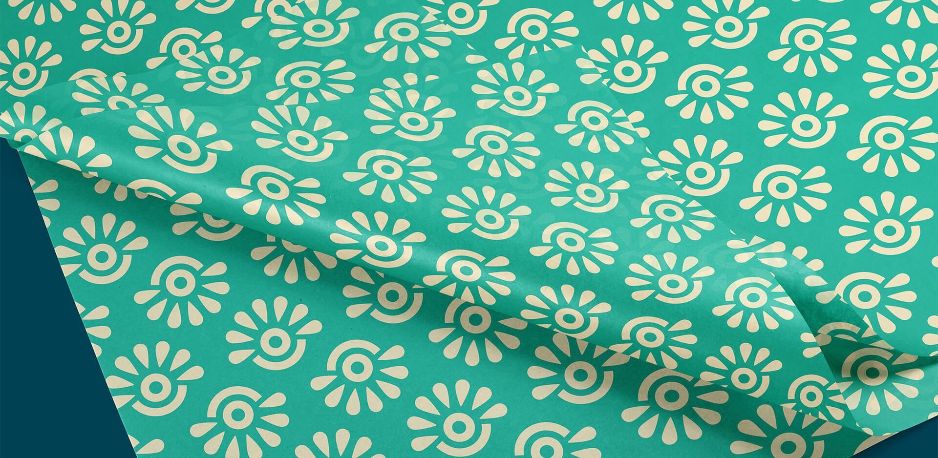
The center, circular shape represents a donut—the food that started this venture (serving as a reminder of where they began). Underneath the circle, there is a shape pulling the logomark up to signify the support of Ali's father as he passes the baton. Surrounding the top portion is a row of droplets inspired by Mexican artwork and patterns to nod back to her family's roots.
Lots of symbolism packed into this custom logomark, but it remains abstract enough to stay with the business throughout all their food ventures. Even as a one-color mark the logo creates visual interest, drawing people in to discover what they have to offer.
Bold and vibrant color scheme that helps her stand out from other food vendors, while also honoring her Mexican heritage. The typeface has some flare of its own and compliments the shapes found in the logomark.

the impact
"Once the final project came together, I was incredibly proud and eager to get it out in the world!”
Alexandra Feurstein
Owner of Deliciosa LLC
Improved brand recognition and perception of their brand. They feel confident knowing that their logomark is a symbol of their business journey and representative of their Mexican heritage—the soul of who they are.
Deliciasa's new logo is bright, fun and modern—drawing in new customers and making a big impact at events. Return customers can find them easily amongst all the other food vendors.
Since working together they've expanded their menu to include pizza. Because of our forward-thinking and strategic design, they are able to continue using their logo since it didn't tie them to a single food product.
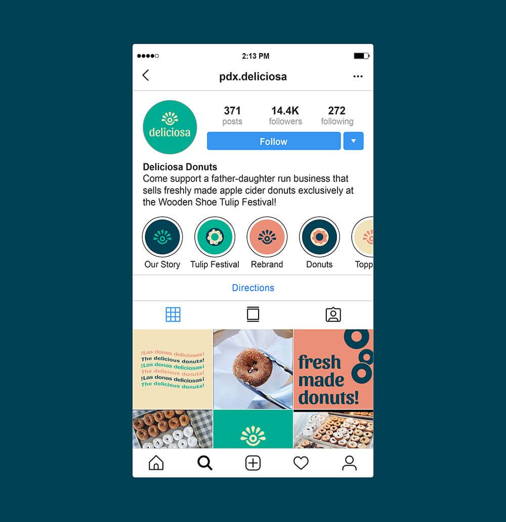
To see where Deliciosa is popping up next, give them a follow on
Instagram.

Discover More