Creative design terms explained
Originally published on RLC Roots via Substack. Subscribe to be the first to see our newest posts.
Renee Garcia • March 4, 2025
A reference guide to understand the language I use and the deliverables we can create together
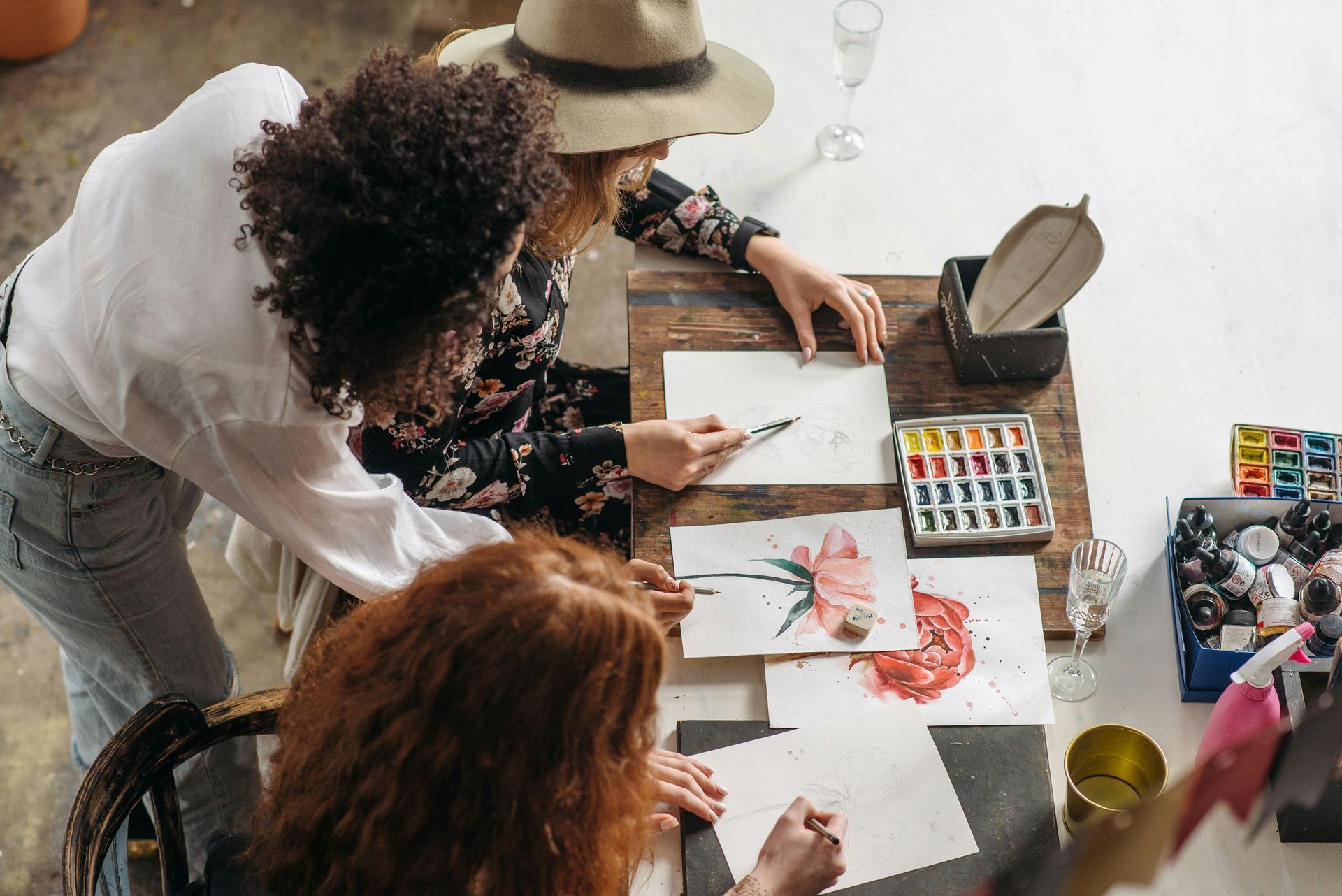
Carefully crafted list of simplified definitions for words I use on a daily basis as a creative designer. They are familiar to me, but I understand that they might be new to you. I am constantly adding to this list as I have conversations with clients and associates.
Advertising: getting your product or service in front of more eyes, so you can make more sales.
Branding: how you make people feel when they interact with you or your product.
Brand Guidelines (also know as "Brand Standards"): a comprehensive document that defines your brand foundations and visual guidelines to help you make the right impact and show up consistently for your customers, so you can build trust and increase brand recognition.
Brand strategy: the foundation of your brand that includes: your vision, mission, values, ideal customer, positioning and more. Helps you get clear on how you want your clients / customers to feel when they encounter your brand in the wild, so you can craft a plan to make the right impression with them.
CMYK: Cyan, Magenta, Yellow, Black—the colors used to build printed colors.
Connection Chat: my version of a discovery call. This is where we talk through your needs, project details, and any questions that you might have before we work together. Helps us both determine whether or not we are a good fit to work together.
Favicon: that tiny version of your logo that shows up on the tab of a new web page.
Font:
a specific design style within a typeface.
Logo family: the set of logos that are created so you can place it on a wide range of spaces with ease. They make your logo more versatile and scalable.
Logo: an identifying mark that represents a business or organization.
Logomark: the simplest version of your logo (they don't often include text).
Marketing: building a name for yourself and better understanding your customers, so you can show up in the right places.
Pixel: the squares that make up an image; can be seen when you zoom into a photo or png file. Quality is negatively impacted when you drastically change their size.
Primary logo: the main layout of your logo that is used as long as there is enough available space.
RGB: Red, Green, Blue—the colors of light used to create colors on screens.
Styleguide: a visual reference sheet that allows you to keep your visual identity consistent throughout every touchpoint.
Touchpoint: places your brand shows up in front of its customers; can include apparel, social media, packaging, merchandise, advertising and more.
Typeface: the entire collection of font styles (heavy, bold, italic, light, etc).
Vector:
artwork that can be scaled up and down infinitely, while keeping crisp edges and retaining quality.
I hope this reference makes branding and creative design feel more approachable. There are a lot of fancy terms that are thrown around that can make the topic feel intimidating, but it doesn't have to be. Still don't understand a lot of terms on this list? That's okay, I'll help you along the way. This is my area of expertise and you have your own zone of genius that you'll be teaching me about.
Don't agree with one of my definitions? Let's talk about it, I'm always learning and growing.

You’re likely familiar with the words if you spend time in the business world, but do you understand them? Hopefully you can get some clarity on these two terms after reading through this post.
What happens when a creative process, one that once took days, weeks, months, YEARS, is now compressed into one click of a button? What is lost in the pursuit of convenience, speed, and affordability?
And what might the spread of AI-generated content might mean for the future of news and research.

Reminders for fellow eco-entrepreneurs and purpose driven brands who might be feeling the weight of the climate crisis on their shoulders. Click for some encouragement and inspiration to continue towards your daring mission!

There are so many challenges when it comes to selecting the best platform for your business, building a website, and making sure everything is accessible. I certainly learned a lot during both builds, but I would have rather made the right choice for me the first time around. Click to learn about my rough website building process to help you avoid a few headaches.

In this end of summer season, I’ve been thinking about times of change. The once blooming flowers are dropping to the ground, gardens are full of abundance, and surrounding colors in nature are starting to shift. Life has many twists and turns—it’s easy to get lost along the way. Today Angela and I will be sharing some of our entrepreneurial and life experiences that have pushed us to explore something new.

Tempting as it may be to mimic along when we see a cool trend, this may not be the best thing for our business. Our tastes change over time, so it’s natural to want to change things up accordingly. That’s why it’s important to create a brand rooted in strategy. When we know our ideal client / customer, we can ensure our brand continues to reflect their interests. In a world where people seem to be longing for authenticity, don't be afraid to be stay true to yourself.

Of course there is no one like YOU! Don’t let that go to your head when you are setting the foundation for your brand. It’s easy to be fooled into thinking that there is no overlap between your target audience and those of another business. Read more to learn how to identify your business competition and learn about shifting your mindset around the idea of competition.

You might be asking yourself—what is a logo family and why might I need one? Let’s walk through 3 reasons to expand your brand assets to create a logo family.

This post was inspired by recent conversations and reflections with my dear friend Angela from Angela Ellison Creative who went through a major rebrand at the start of the year. Her rebrand was one of my favorite branding projects to date—we both are in love with how her visual identity turned out and, as her designer, I could not be more proud of how well she is transforming all her brand touch points. Knowing when to rebrand is really tricky, this guide might help you make the right choice for you and your business.

People might claim to have the quick solution, an easier path to reach your goals, but the truth is it isn’t likely to be happen overnight. It takes time to establish a business, standards and processes that work for you. What works for someone else might not work for you, people are all unique and their businesses should reflect that. Click to read about signs you might be ready for a change.